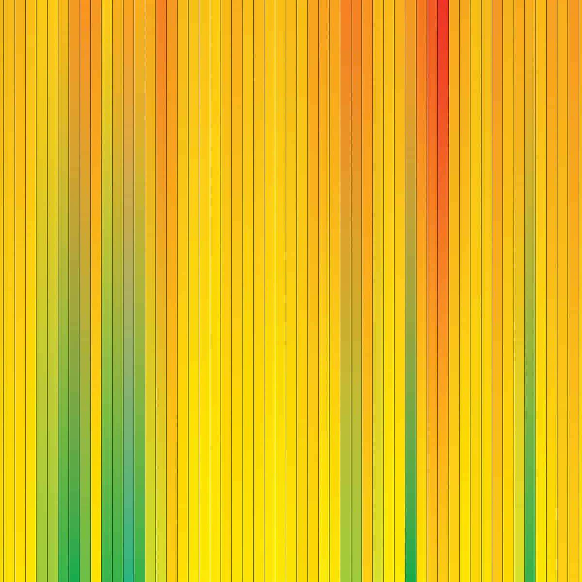
Being a bit nerdy at times I decided to make a colour graph of the temperature recordings we’d taken over the year, for each day the colour graduates between the maximum and minimum temperature recorded, the barometric reading for the days has been overlayed.

As it’s a bit small to view on this webpage I put a larger version here, there’s also one with rain and wind speeds on here.


